Eat It Up

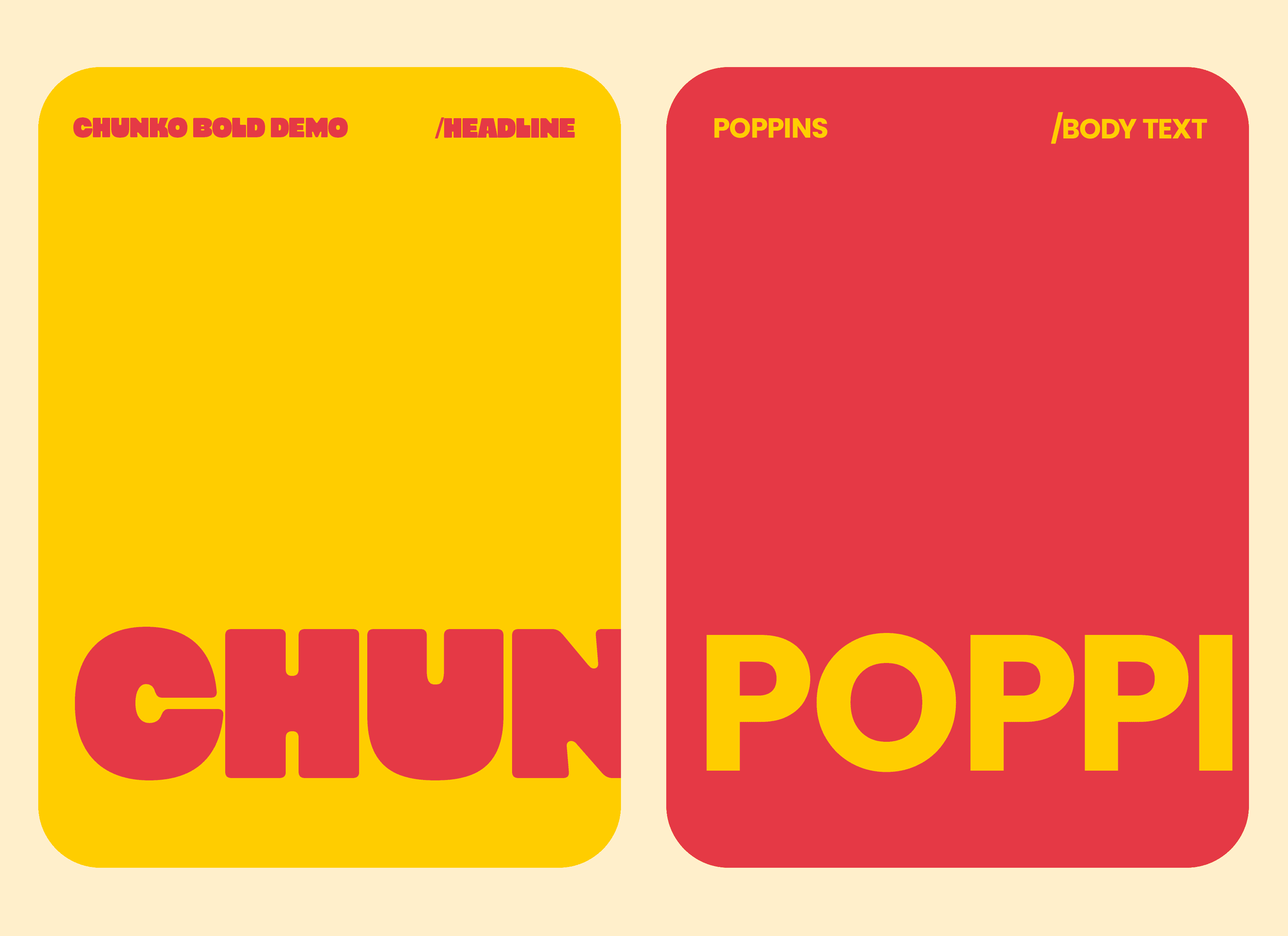
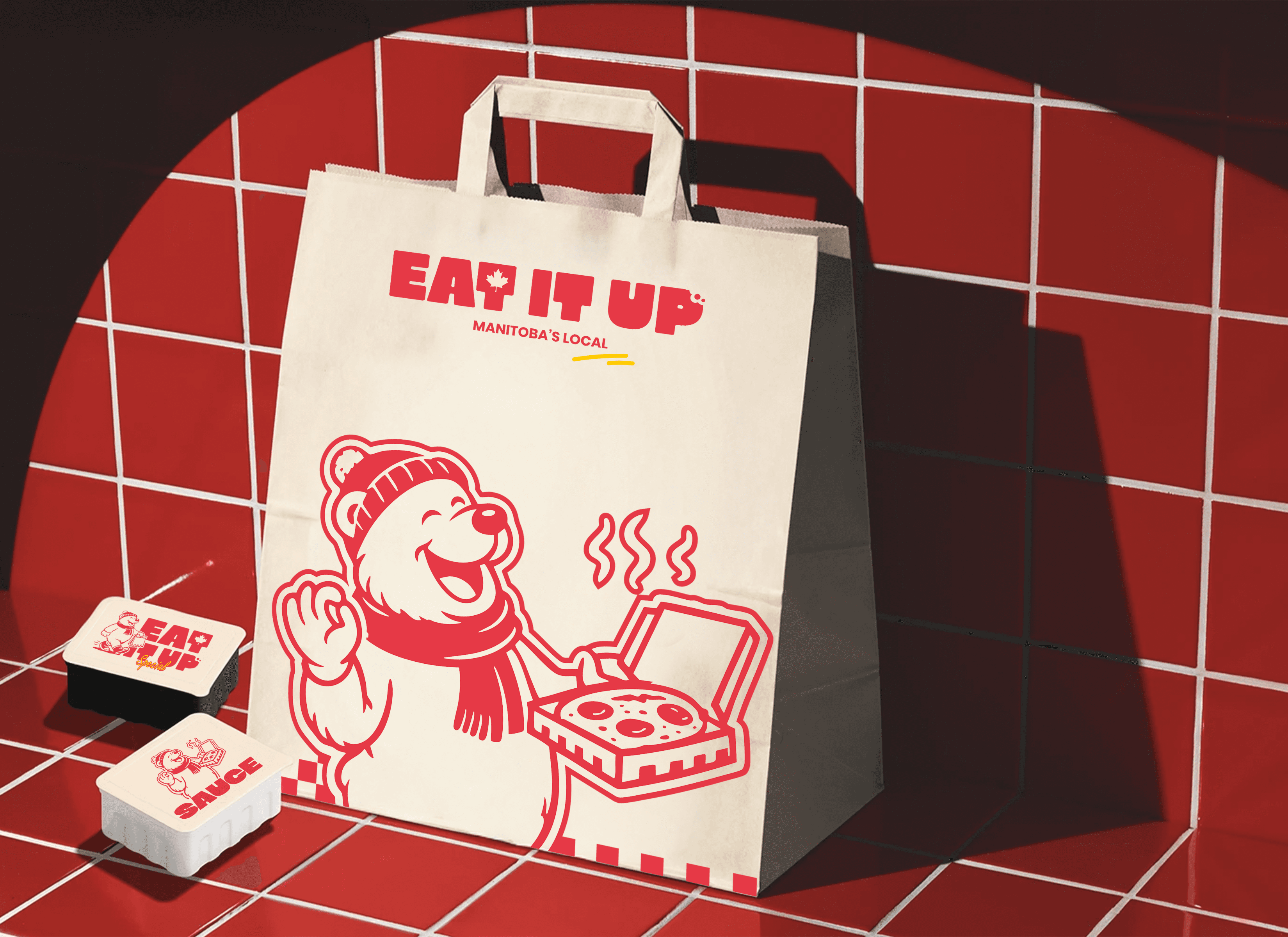
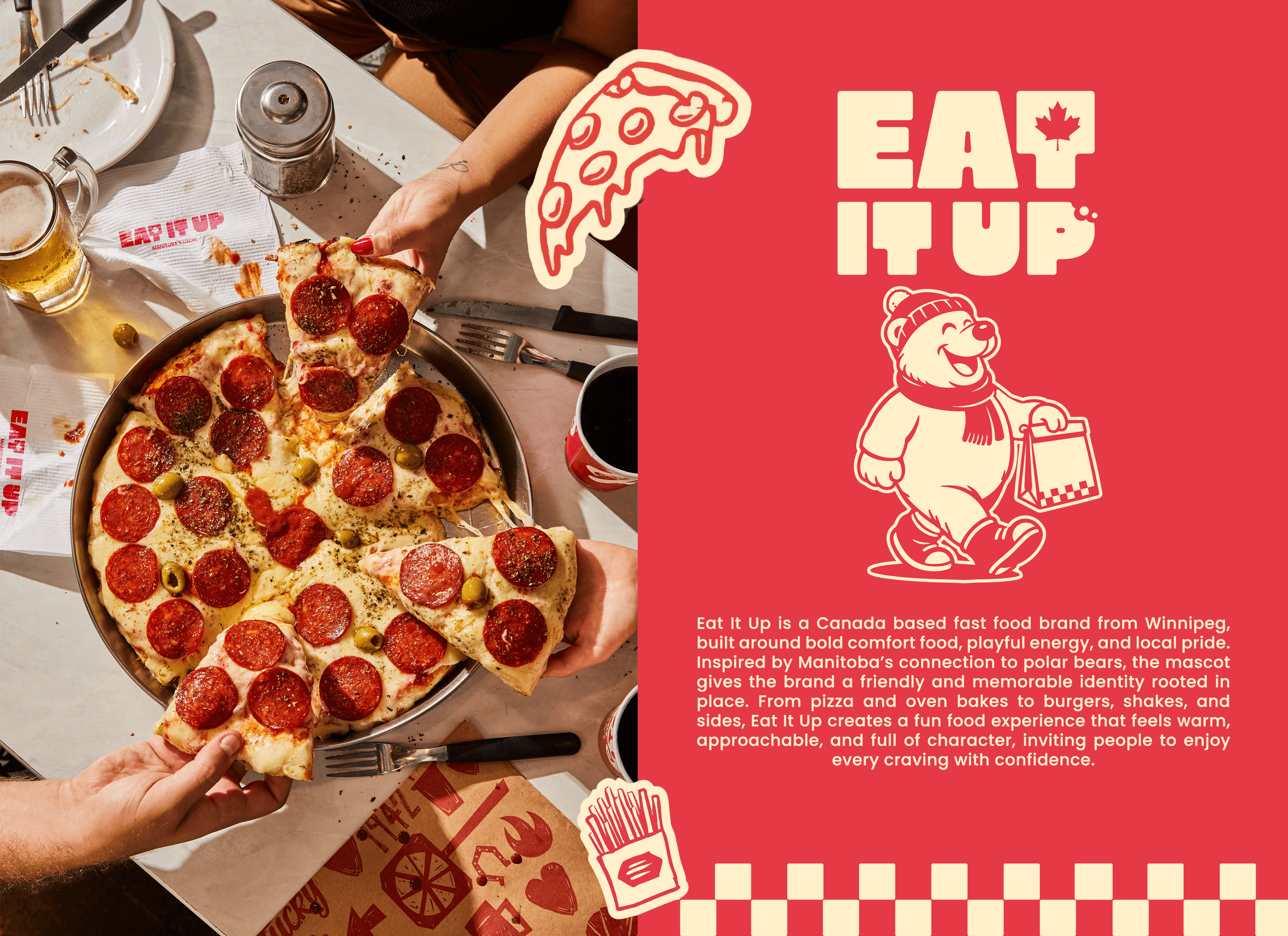
Eat It Up is a Manitoba-based fast-food brand built around bold comfort food, playful energy, and local pride. The identity combines chunky typography, vibrant colors, food illustrations, and a polar bear mascot to create a warm, memorable brand experience.

INDUSTRY

Food & Beverage / Restaurant Branding / Fast Food

CATEGORY

Branding

Eat It Up

Eat It Up is a Manitoba-based fast-food brand built around bold comfort food, playful energy, and local pride. The identity combines chunky typography, vibrant colors, food illustrations, and a polar bear mascot to create a warm, memorable brand experience.

INDUSTRY

Food & Beverage / Restaurant Branding / Fast Food

CATEGORY

Branding

The Problem

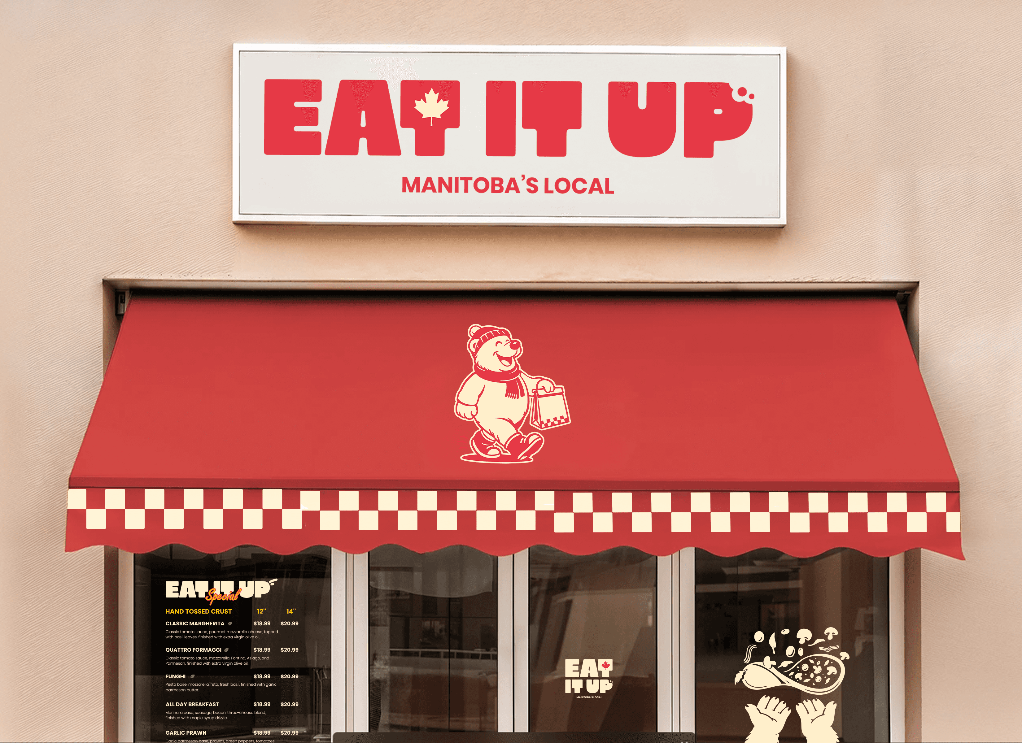
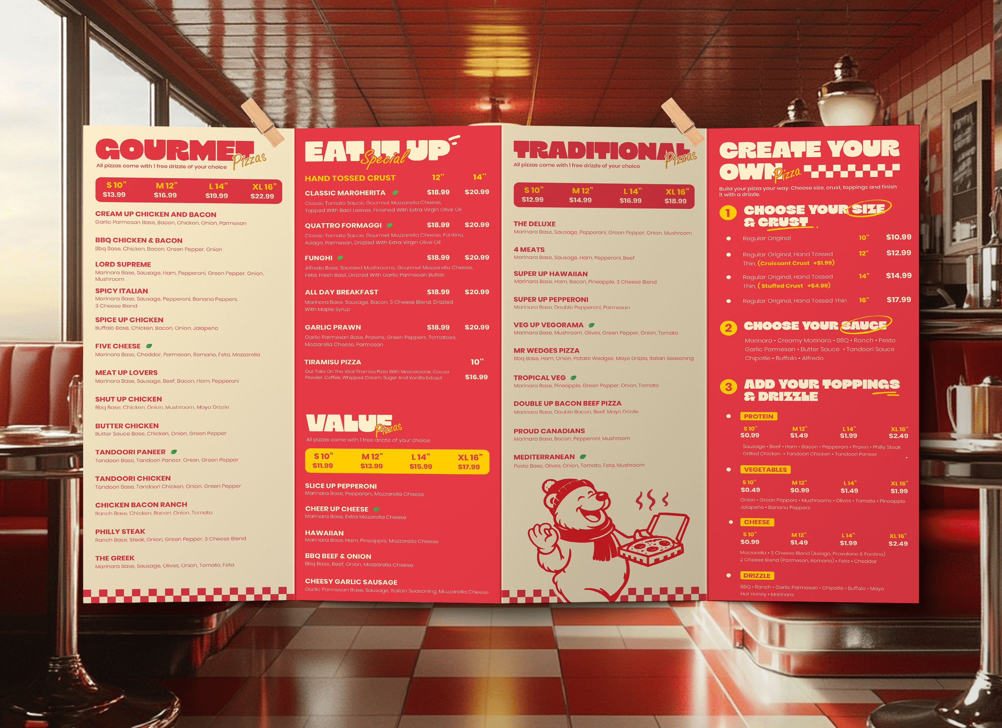
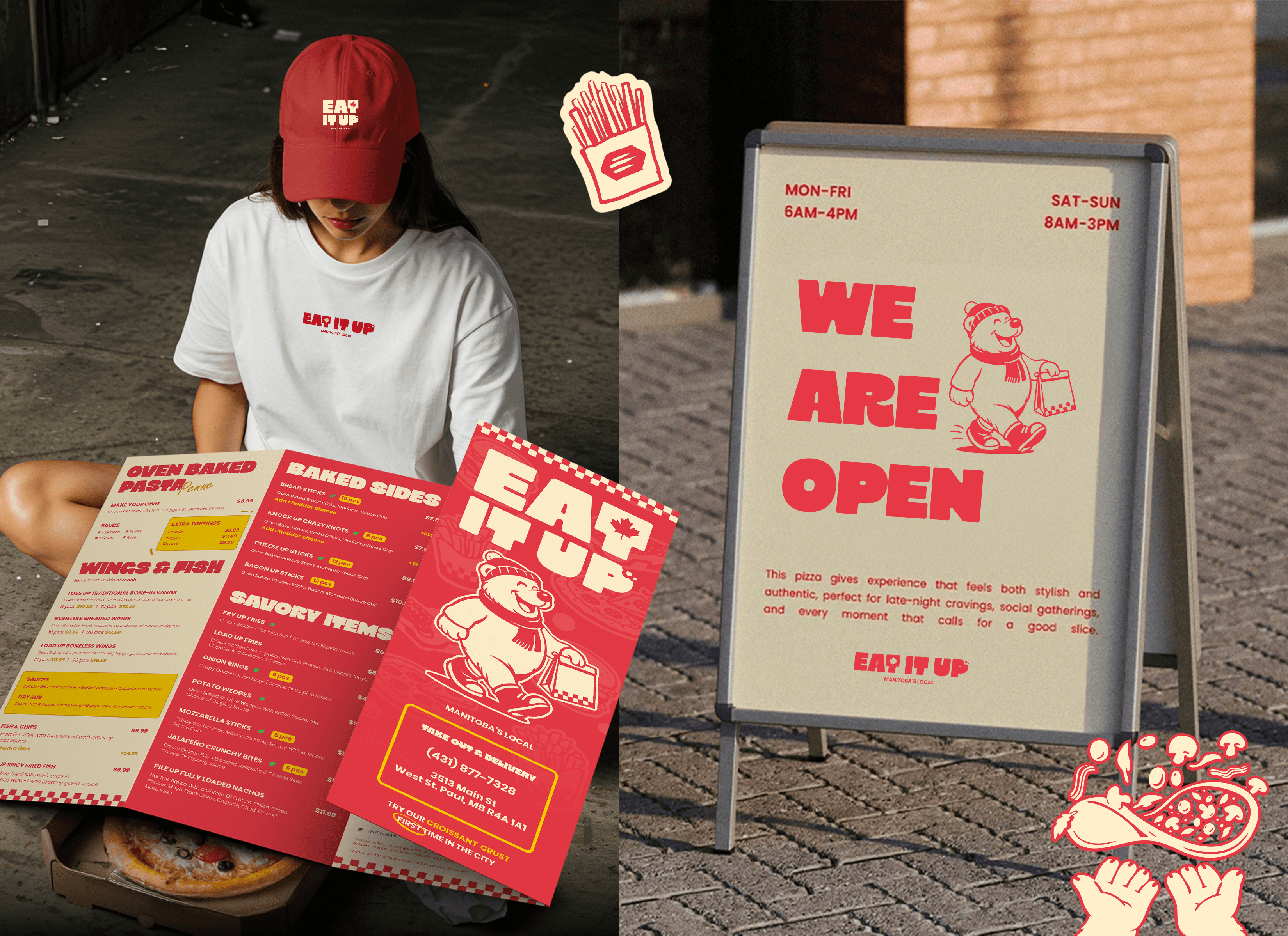
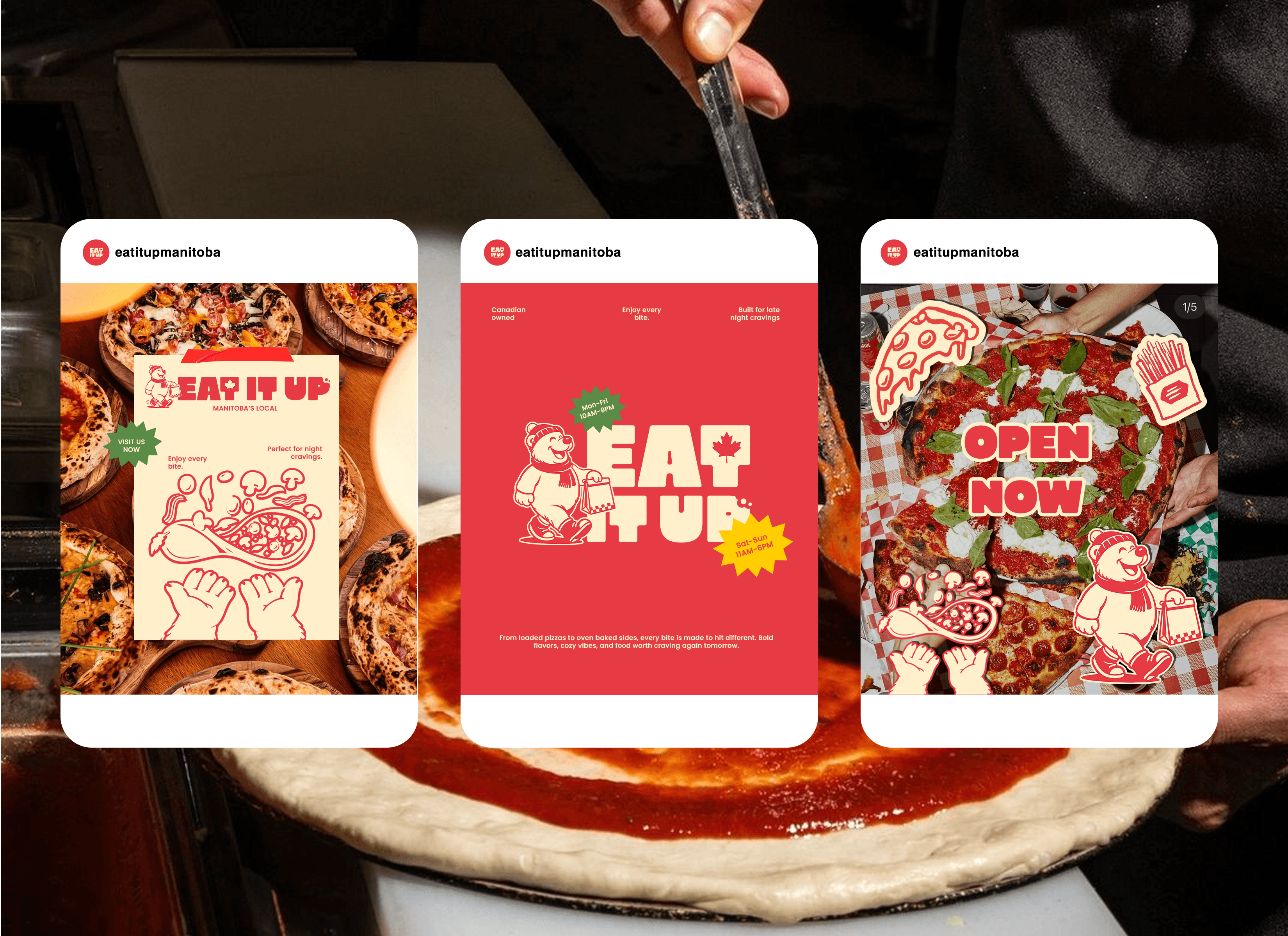
Eat It Up needed a memorable visual identity that could make the brand feel local, friendly, and instantly recognizable across both physical and digital touchpoints. The challenge was to create a system that worked beyond just a logo, extending into menus, packaging, storefront signage, uniforms, and social media while still feeling fun, approachable, and connected to Winnipeg.

The Solution

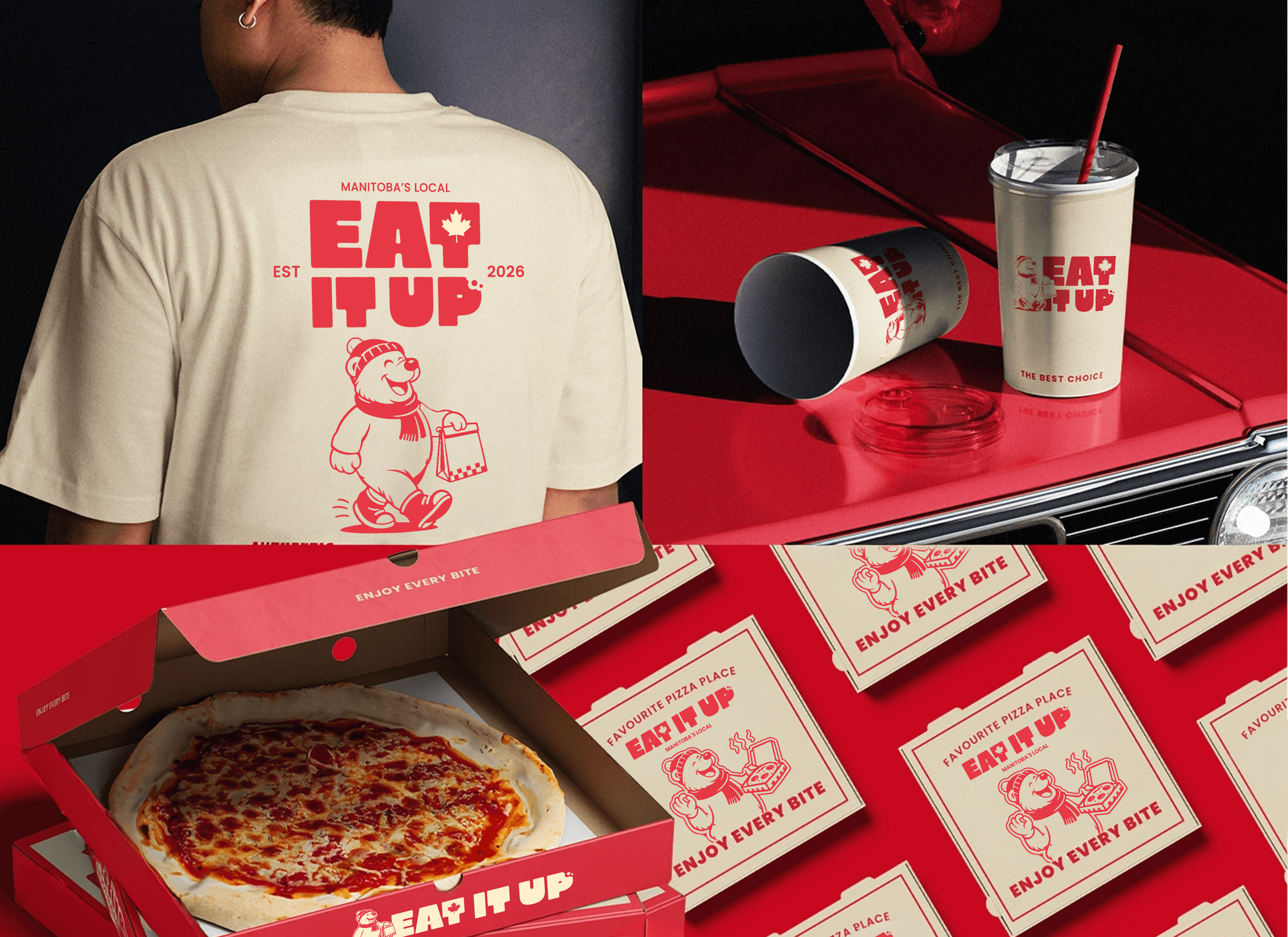
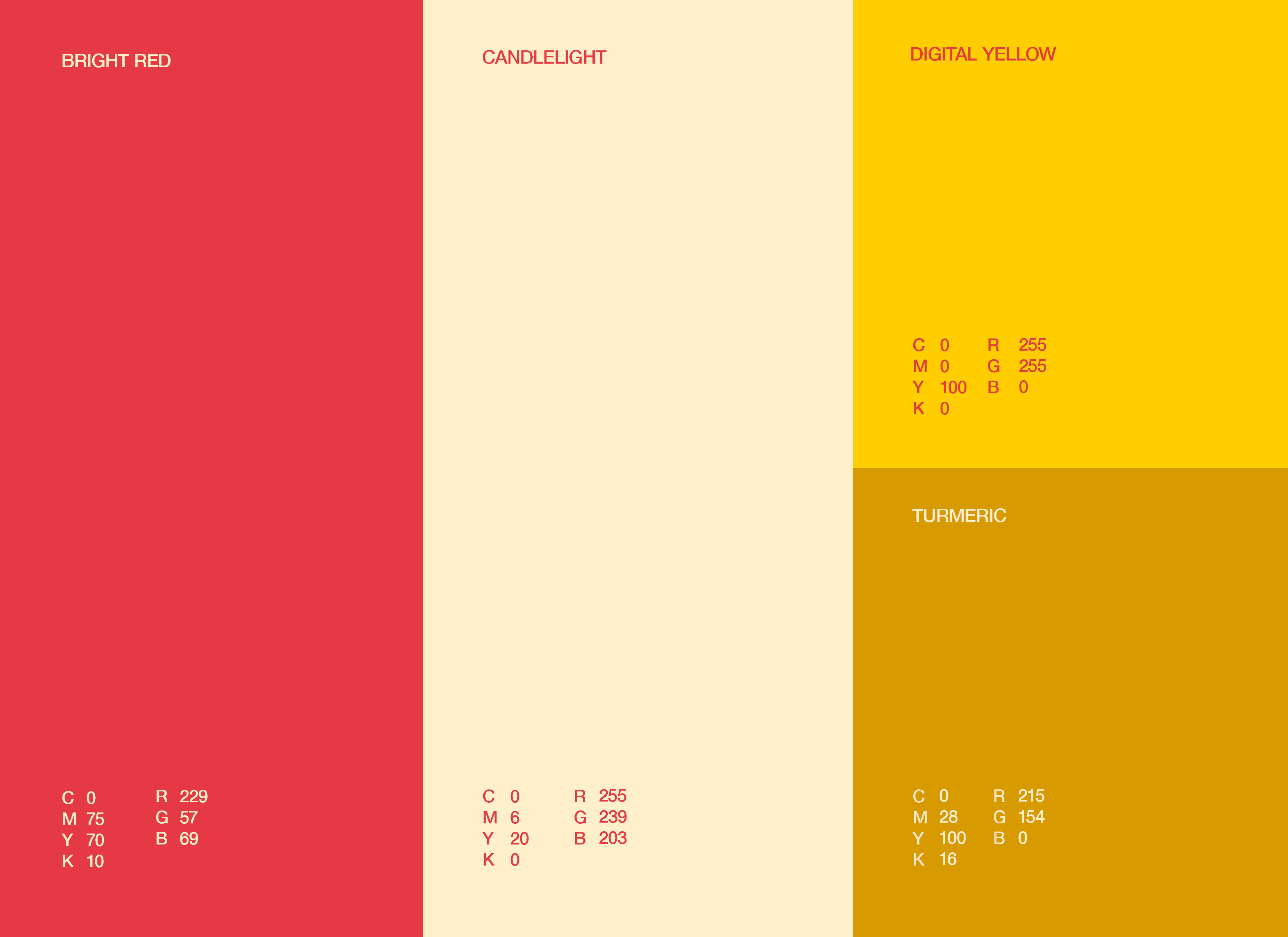
The identity was built around a bold red and cream color palette, chunky typography, playful food illustrations, and a polar bear mascot inspired by Manitoba’s local character. The system was applied across packaging, takeout bags, pizza boxes, menus, storefront signage, apparel, cups, and social media posts, creating a cohesive brand experience that feels warm, energetic, and easy to recognize.
Portfolio of Levin Thomas

© 2026 All rights reserved

Portfolio of Levin Thomas

© 2026 All rights reserved

Portfolio of Levin Thomas

© 2026 All rights reserved